

News.com’s Brand-new Widget


C|net's news.com has made a few changes. Among other things, they've added a little feature that lets you save stories to be read later. The idea is, if you don't have time right now put select stories in a folder so that you can read them at your leisure, without having to search for them again.
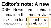
Each headline carries a small icon accompanied with ‘save’ next to it. What’s intriguing is that they have not used the standard floppy disk icon for save but a ‘my documents’ kind of icon, perhaps to denote that you’re adding it to a folder. The saved stories appear in this thing at top that looks like a button but works like a pull down menu. The button/pull down menu also has a numerical indicator that tells you how many stories you’ve added. You can save up to 10 stories.
It doesn’t work so well right now. For example, the apostrophe[‘] character in headlines appears in Unicode when displayed in the menu. So Editor’s Note in the headline becomes Editor's Note once inside the menu. In Mozilla, such headlines can not be added at all. There are other problems with the site when viewed with Mozilla but I don’t want to get into that.
Identifying the need
What interests me more is how strong was the need for such a feature when the design team took a decision to include it. What factors were considered? How did the idea really originate? Did someone notice this feature on another site or was it because they identified a need?
More questions come up in mind. If they identified the feature first, how did they go about researching whether a need for such a feature existed or not? If they identified the need first, what kind of user research would have helped identify it? How frequently will it be used? Given that the saved stories disappear when browser is closed and then reopened, is the said reasoning for the feature really credible?
Attention grabber
The design assigns a prominent place to the menu right under the tabs for different sections. This has more than one explanation. One, they want the first time users to notice it and click it to understand what it does. Two, if a user misses it at the first go, and gets puzzled at the ‘save’ icon next to headlines, the menu – only a few pixels away - comes to the rescue as a way of explanation since it is titled as ‘saved stories.’
But there are problems with this approach. The biggest one is, it gets too much attention. Seasoned interface designers understand that users come with a limited attention span. You can give too much attention to something but only at the expense of taking it away from other objects. On this page it has two consequences:
One – it is disruptive. You’re on the site looking for something and here this neat little thing that catches your eye. You lose your focus. It makes you think. You lose time.
Two – the attention it gets is at the expense of tabs and search, both of which are in its close proximity. People looking for search and those looking to go to the ‘enterprise hardware’ section [the tab right at top of this menu] are likely to be most distracted by the menu.
Engagement - not a good idea
Just a couple of days back, the Interaction Architects group on Yahoo! was discussing the merits of engagement and concluded that it is not always a good thing. I completely agree. Movies should be engaging not web pages. I have an interesting analogy in this context.
On a past visit to Google I was so captivated by its new holiday logo – must have looked at it for half a minute - that I completely forgot what I came to search! What surprised me even more was that I wasn’t angry at this. On any other site, I would have been very annoyed but not on Google. Google has provided such overwhelming good experiences in the past that it was okay if it messed up once in a while :).
Anyway, my point is, engagement can be utterly distracting and that’s never a good thing unless the goal of your users is to be engaged, something extremely rare. People go to a website looking for stuff and the design should make the process as easy as possible.
So the million dollar question here is does this feature add so much value that such behaviour should be ignored? I seriously doubt that.
There are a couple of other problems. First, when you encounter the menu, the only way to find out what it does is by pressing it. But first timers will be very reluctant to do that given it doesn’t look like a menu at all, it looks like a button. People expect to go to another page when they press a button so this menu clearly violates their conceptual model.
Second, the save icon and the text does not have a ToolTip so if you have no idea what it does and you hover over it, no explanation is offered. Very surprising because most other images and buttons come with a ToolTip.
The India angle
Another reason this new feature is interesting is because it was first used on an Indian news site. HindustanTimes.com was featured in Forbes as one of the best international news site for this very reason. TimesofIndia.com, its main rival recently picked up the feature and implemented on their site too. Both these sites are online versions of India’s largest selling English dailies.
The connection goes even further, it was actually one of the contributors to this blog - Anshuman Singh that implemented this feature on HindustanTimes.com in a redesign that their firm Mindtree Consulting undertook recently.
But the feature is used in a far worse manner on both these sites. Surprisingly, the c|net version comes across as best of all three examples. Let’s take a quick look on the other two versions starting from the worst offender.
 TimesOfIndia calls it ‘clip’ instead of save. Not very intuitive. There’s nothing to tell me what it means except a TootlTip that says ‘Add to Clippings’. Clippings, however are nowhere in sight. What’s worse, adding a clip requires one to log in. Apparently the design team finds the feature so valuable that users are made to register to use it.
 After logging in users are redirected to the homepage and a pop up appears and says that the link to clippings is at the top of the page but the elusive clippings do not appear until one closes the pop-up window. Adding every subsequent clipping brings about a pop up that tells you that your clip has been added.
The only good functionality is that even when you return to the site after closing and reopening the browser, your clippings are still saved at the top of the page.
 HindustanTimes.com has a tiny plus[+] sign next to headlines which on clicking adds the headline to ‘My Links,’ something that is hidden in a corner. ‘My Links’ when clicked, appear in a pop-up window.
Unlike News.com, this site suffers from the other extreme of the attention problem. While News.com was creating trouble by making the feature too pronounced, here it’s the obscurity of the feature that makes it unusable. The [+] sign is too small and doesn’t explain what it does and ‘My Links’ are hidden in a corner.
Then, with so many ads flashing around one is already suffering from a severe attention deficit disorder to notice a co-relation between the two!
Related Links
News.com homepage
C|net editor talks about the redesign
HindustanTimes.com and TimesOfIndia.com
Mindtree consulting
Forbes listing of HindustanTimes
0 Comments so far
<< Blog Home