

I’d give an arm for something original
What frustrates me most about internet is the lack of original thought that goes behind an interface, a software, a business model, a design pattern or what have you. Why's there just one Amazon and one Google? Why don't we innovate more often? Where are original ideas?
I have no doubt that overall interface design has improved across the web these past few years but looked individually, the changes appear mostly incremental that take a product from worse to not bad. It's very rare to come across examples that radically improve an interface by solving a need not identified or addressed before. It's more common to see potential of a product being bogged down under the weight of status quo – those invisible conventions that we so heartily embrace without ever questioning them.
In the early days of the internet "making it run" was enough accomplishment, now we're satisfied merely by making it usable
It’s everywhere - the curse of mediocrity. On shopping sites, news sites, travel sites and even e-mail. Everything is the same as everywhere else. No one seems to the aiming for the next plane. While in the early days of the internet "making it run" was enough accomplishment, now we're satisfied merely by making it usable or designing it around a “best practice.” User Experience professionals, get ambitious! Of course usability is essential to success and conventions can be helpful but how about solving your customers' real needs? There are a plethora of critical user experience problems out there that aren't being addressed.
Let’s take e-mail for example. Two facts stand out. One, its overwhelming use in communication and two, the unsolved problem of managing our overflowing mailboxes. There has been no change in how we are made to organise our mails. E-mail interfaces are at the same level where they were half a decade ago.
We simply get too much e-mail and don’t know how to stay on top
Corporations are struggling to reduce the deluge of e-mails in the mailboxes of their employees. The more mails we get the more the less time we have to do productive work. You may have already heard of the recent story that a telecom chain in UK had to ban internal e-mail due to productivity losses. Even Nielsen’s third annual intranet design report confirms that one of the common themes across several of the intranets was email reduction. Spam is just a part of the picture. The underlying problem is that users everywhere are struggling to manage their e-mails. We simply get too much of it and don’t know how to stay on top.
Mark Hurst of Creative Good says that the answer is not design, it is us. In his report on managing e-mails he encourages us to take control of our inboxes. His answer:
I don’t know whether to call this naivete or stupidity. Delete your mails? You don’t delete your official mails. They’re records! You don’t burn your letters at home either, so why delete e-mails from your loved ones?
If saving or moving them in different folders is a solution, it is not a solution at all. It might give me an illusion that I have an empty inbox but it doesn’t help me when I want to access it again. Consider the following scenario.
I have received an e-mail from my boss telling me the details of a meeting scheduled a month from now. It has an attachment of a document that lists names of managers [don’t ask me why he didn’t just paste it in the mail] to be informed a week before the meeting. Now, where do I store this e-mail – in the boss’s folder, the calander folder, the to do folder, the attachment folder or all of them? No, I get it – I should just get rid of the-mail and celebrate my empty inbox for the rest of the day!
The business opportunity of coming up with an e-mail software that allows superior organising capabilities is staggering.
This is so a design problem. Surprisingly, no one seems to be coming up with a solution for it. The business opportunity of coming up with an e-mail software that allows superior organising capabilities is staggering. It is incredible why this simple fact isn’t well understood.
So why are we stuck here? What stops us from entering the next level in evolution of an interface that doesn’t answer all our needs? Why almost every web-based e-mail site - with only a few notable exceptions - is essentially a copy and paste of the other?
I think one explanation to all those questions lies in our blind acceptance of design conventions. When something is so widespread and used by such large numbers, designers just don’t ask tough questions like: “does it really address the needs of its users”. Copy and paste is easier.
If you are involved in a design project and wish to evaluate your product, its interface, or even a small feature of the interface; it helps to understand the context in which it exists. This is actually the first step. Folks at Adaptive Path call it the ‘discovery’ process. It involves asking yourself questions that go something like:
Why does it exist?
What are its origins?
What needs does it serve?
What problems does it solve?
To truly innovate, we must transcend the boundaries that hold us.
Answering the above questions will widen your understanding of what your product can achieve. But to truly innovate, to come up with out-of-the-box solutions that address needs of users never identified before, you must look at it beyond the product or its current capabilities. What are the fundamental needs of the users. Not in terms of your product/interface, but beyond that. What do they really want to do - beyond what is currently offered to them.
Pardon me if that sounds rather melodramatic but I really believe in design innovation. I’ve put it to work in the past and it has delivered great results.
 Opera’s best kept secret
M2 is the e-mail client that comes bundled with Opera 7 browser. I downloaded version 7.11 a few days ago and almost instantly recognised its great potential. It represents that leap in design I was talking about and conclusively disproves Hurst's theory that "users have to take the lead".
M2 has a truly innovative interface that has the potential to make the lives of its users radically easier.
This has already become a marathon post, let me quickly explain its three innovative features [the last two of which, I must brag, I had previously conceived myself for such a product. Honest!]. View full screenshot of M2 in a new window.
a. Access points
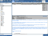 M2 has no folders as such but here’s the remarkable idea: all e-mails can be viewed at multiple access points [on the left] while being stored at only one place. In the previously mentioned scenario, I can get back to my boss’s e-mail at all those places I mentioned – boss’s access point featured under “contacts” - yes, the address book here also displays all mails from that person!, under “calander” not supported now but promised in next version, under “to do” access point - see labels in the screenshot and yes there’s even an “attachments” access point. Everything appears automatically under those access points, you do not need to move my mails or create a filter!
Big leap from how e-mail has so far been managed. Those are amazing people at Opera. While it has some weaknesses – it seems like a hurriedly assembled product - but the concept itself is outstanding.
b. Labelling
You can label any e-mail simply by clicking next to the e-mail under the labels column. It will show you a range of labelling options: Important, To do, Mail back, Call back, Meeting, Funny and Valuable. Labelled e-mails immediately show up under the 'Labels' access point.
c. Quick reply
Those of you who send dozens of e-mails everyday, this is invaluable. To reply to an incoming mail, you don’t need to hit reply and wait for the new msg window to open, set focus to the message area, write a message and press send. In M2, just select a message in the inbox, type out the reply in a IM type comment box and hit quick reply. All done.
M2 is truly awesome but don’t download it just yet
I struggled with it for 3-4 days and ultimately decided against its continued use because of its limitations. For one, I can’t send HTML messages. Executives from Opera say [in the support forums] that it's a security risk and will not be offered in future versions too. All this while users have been crying themselves hoarse in the forums saying that they need this feature. Responding to a post of mine, one executive finally admitted that they are now considering HTML.
It is interesting to note though that folks at Opera recognise its current limitations - there's no mention of M2 under either the product section or the download page of their website. Though I got the impression that security is perceived to be its most important strength.
Other issues: no spell check, no hotmail support [but both these can be managed with independent add on utilities], poor support for incoming HTML e-mails, no option to delete e-mail copy from the server and no "save as" option for storing e-mails on the hard disk. But the greatest threat that kept me away was a fear of crashing the browser and losing all my e-mails. I did come across a one or two horror stories.
The real advantage with M2 is not security but its capabilities as an e-mail organiser.
So my suggestion to you is, keep an eye on it. Try it when later versions come out. My suggestion to folks at Opera: realise the true strength of M2, it’s not security, it is the organising capabilities. Improve those features, introduce HTML and spell check and make it more stable. You’ll have a great product in M2.
Keep focusing too much on security and you will be chasing an impossible dream. As Andrew Odlyzko - an economist explains, there is no such thing as a perfectly secure system [pdf].
Related Links
M2 page on Opera.com
M2's features [translated from German]
Story on alternative e-mail programs
I have no doubt that overall interface design has improved across the web these past few years but looked individually, the changes appear mostly incremental that take a product from worse to not bad. It's very rare to come across examples that radically improve an interface by solving a need not identified or addressed before. It's more common to see potential of a product being bogged down under the weight of status quo – those invisible conventions that we so heartily embrace without ever questioning them.
In the early days of the internet "making it run" was enough accomplishment, now we're satisfied merely by making it usable
It’s everywhere - the curse of mediocrity. On shopping sites, news sites, travel sites and even e-mail. Everything is the same as everywhere else. No one seems to the aiming for the next plane. While in the early days of the internet "making it run" was enough accomplishment, now we're satisfied merely by making it usable or designing it around a “best practice.” User Experience professionals, get ambitious! Of course usability is essential to success and conventions can be helpful but how about solving your customers' real needs? There are a plethora of critical user experience problems out there that aren't being addressed.
Let’s take e-mail for example. Two facts stand out. One, its overwhelming use in communication and two, the unsolved problem of managing our overflowing mailboxes. There has been no change in how we are made to organise our mails. E-mail interfaces are at the same level where they were half a decade ago.
We simply get too much e-mail and don’t know how to stay on top
Corporations are struggling to reduce the deluge of e-mails in the mailboxes of their employees. The more mails we get the more the less time we have to do productive work. You may have already heard of the recent story that a telecom chain in UK had to ban internal e-mail due to productivity losses. Even Nielsen’s third annual intranet design report confirms that one of the common themes across several of the intranets was email reduction. Spam is just a part of the picture. The underlying problem is that users everywhere are struggling to manage their e-mails. We simply get too much of it and don’t know how to stay on top.
Mark Hurst of Creative Good says that the answer is not design, it is us. In his report on managing e-mails he encourages us to take control of our inboxes. His answer:
...clear out incoming e-mails before they pile up too high in the inbox. Delete most of them, file some of them (in mail folders or elsewhere), but most importantly, get them all out of the inbox before they really begin to pile up. Keep the inbox empty.And once again at another place under “how often to empty” he suggests this as the first occasion:
As e-mails arrive. As soon as a batch of new e-mails arrives, engage and delete the new messages, thereby bringing the inbox back to a count of zero. [his italics]
I don’t know whether to call this naivete or stupidity. Delete your mails? You don’t delete your official mails. They’re records! You don’t burn your letters at home either, so why delete e-mails from your loved ones?
If saving or moving them in different folders is a solution, it is not a solution at all. It might give me an illusion that I have an empty inbox but it doesn’t help me when I want to access it again. Consider the following scenario.
I have received an e-mail from my boss telling me the details of a meeting scheduled a month from now. It has an attachment of a document that lists names of managers [don’t ask me why he didn’t just paste it in the mail] to be informed a week before the meeting. Now, where do I store this e-mail – in the boss’s folder, the calander folder, the to do folder, the attachment folder or all of them? No, I get it – I should just get rid of the-mail and celebrate my empty inbox for the rest of the day!
The business opportunity of coming up with an e-mail software that allows superior organising capabilities is staggering.
This is so a design problem. Surprisingly, no one seems to be coming up with a solution for it. The business opportunity of coming up with an e-mail software that allows superior organising capabilities is staggering. It is incredible why this simple fact isn’t well understood.
So why are we stuck here? What stops us from entering the next level in evolution of an interface that doesn’t answer all our needs? Why almost every web-based e-mail site - with only a few notable exceptions - is essentially a copy and paste of the other?
I think one explanation to all those questions lies in our blind acceptance of design conventions. When something is so widespread and used by such large numbers, designers just don’t ask tough questions like: “does it really address the needs of its users”. Copy and paste is easier.
If you are involved in a design project and wish to evaluate your product, its interface, or even a small feature of the interface; it helps to understand the context in which it exists. This is actually the first step. Folks at Adaptive Path call it the ‘discovery’ process. It involves asking yourself questions that go something like:
Why does it exist?
What are its origins?
What needs does it serve?
What problems does it solve?
To truly innovate, we must transcend the boundaries that hold us.
Answering the above questions will widen your understanding of what your product can achieve. But to truly innovate, to come up with out-of-the-box solutions that address needs of users never identified before, you must look at it beyond the product or its current capabilities. What are the fundamental needs of the users. Not in terms of your product/interface, but beyond that. What do they really want to do - beyond what is currently offered to them.
Pardon me if that sounds rather melodramatic but I really believe in design innovation. I’ve put it to work in the past and it has delivered great results.
Opera’s best kept secretM2 is the e-mail client that comes bundled with Opera 7 browser. I downloaded version 7.11 a few days ago and almost instantly recognised its great potential. It represents that leap in design I was talking about and conclusively disproves Hurst's theory that "users have to take the lead".
M2 has a truly innovative interface that has the potential to make the lives of its users radically easier.
This has already become a marathon post, let me quickly explain its three innovative features [the last two of which, I must brag, I had previously conceived myself for such a product. Honest!]. View full screenshot of M2 in a new window.
a. Access points
 M2 has no folders as such but here’s the remarkable idea: all e-mails can be viewed at multiple access points [on the left] while being stored at only one place. In the previously mentioned scenario, I can get back to my boss’s e-mail at all those places I mentioned – boss’s access point featured under “contacts” - yes, the address book here also displays all mails from that person!, under “calander” not supported now but promised in next version, under “to do” access point - see labels in the screenshot and yes there’s even an “attachments” access point. Everything appears automatically under those access points, you do not need to move my mails or create a filter!
Big leap from how e-mail has so far been managed. Those are amazing people at Opera. While it has some weaknesses – it seems like a hurriedly assembled product - but the concept itself is outstanding.
b. Labelling
You can label any e-mail simply by clicking next to the e-mail under the labels column. It will show you a range of labelling options: Important, To do, Mail back, Call back, Meeting, Funny and Valuable. Labelled e-mails immediately show up under the 'Labels' access point.
c. Quick reply
Those of you who send dozens of e-mails everyday, this is invaluable. To reply to an incoming mail, you don’t need to hit reply and wait for the new msg window to open, set focus to the message area, write a message and press send. In M2, just select a message in the inbox, type out the reply in a IM type comment box and hit quick reply. All done.
M2 is truly awesome but don’t download it just yet
I struggled with it for 3-4 days and ultimately decided against its continued use because of its limitations. For one, I can’t send HTML messages. Executives from Opera say [in the support forums] that it's a security risk and will not be offered in future versions too. All this while users have been crying themselves hoarse in the forums saying that they need this feature. Responding to a post of mine, one executive finally admitted that they are now considering HTML.
It is interesting to note though that folks at Opera recognise its current limitations - there's no mention of M2 under either the product section or the download page of their website. Though I got the impression that security is perceived to be its most important strength.
Other issues: no spell check, no hotmail support [but both these can be managed with independent add on utilities], poor support for incoming HTML e-mails, no option to delete e-mail copy from the server and no "save as" option for storing e-mails on the hard disk. But the greatest threat that kept me away was a fear of crashing the browser and losing all my e-mails. I did come across a one or two horror stories.
The real advantage with M2 is not security but its capabilities as an e-mail organiser.
So my suggestion to you is, keep an eye on it. Try it when later versions come out. My suggestion to folks at Opera: realise the true strength of M2, it’s not security, it is the organising capabilities. Improve those features, introduce HTML and spell check and make it more stable. You’ll have a great product in M2.
Keep focusing too much on security and you will be chasing an impossible dream. As Andrew Odlyzko - an economist explains, there is no such thing as a perfectly secure system [pdf].
Related Links
M2 page on Opera.com
M2's features [translated from German]
Story on alternative e-mail programs


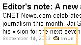
 TimesOfIndia calls it ‘clip’ instead of save. Not very intuitive. There’s nothing to tell me what it means except a TootlTip that says ‘Add to Clippings’. Clippings, however are nowhere in sight. What’s worse, adding a clip requires one to log in. Apparently the design team finds the feature so valuable that users are made to register to use it.
  HindustanTimes.com has a tiny plus[+] sign next to headlines which on clicking adds the headline to ‘My Links,’ something that is hidden in a corner. ‘My Links’ when clicked, appear in a pop-up window.