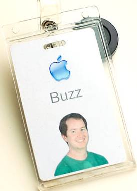
Design of an Apple Badge
 I love this Apple employee badge. It's a perfect example of good design.
I've always hated employee badges otherwise. Employees who stride around company premises proudly displaying them appear funny to me. Why? Because I'm passionate about innovation and this practice reeks of bureaucracy and an attempt to stifle individual creativity. It appears (to me) somehow symbolic to tagging criminals in a jail. It says I must leave my individuality outside the door. Once I'm in, I'm part of the "herd," a cog in the wheel, no more. Thankfully, I've never had to work at a place where I had to wear one. Even while visiting companies I try to keep the visitors badge in my pocket unless specifically instructed to "keep it visible at all times."
But this post isn't about my personal preferences, it's about design.
 So what's wrong with the design of a typical employee ID badge? Too much extraneous information. Lets take three examples. Consider this badge at right, what's the most prominent piece of information on it? That this person is an "EMPLOYEE". Well, duh! Of course she's an employee. Someone at this company thought that differentiating between employees, visitors and contractors was the most important goal of a badge. But hey, what about the name of the person? Can you make out the name in this badge? I can't. Besides, if differentiating employees from others is so important, it can be done by color coding badges to different categories. So, for example, when you see a yellow badge from a distance you instantly know that's a visitor. A much more effective way.
 In this example, while the name is prominent, it is the large bar-code that stands out from the background. What value does it serve to a person looking at it - none. Could it have been at the back - most certainly. The picture isn't sufficiently clear and the logo is too big. In the designation, "of MagicalMountain.net" is extraneous. Just "Owner" would have been sufficient. The logo comes with an illegible slogan and three other phrases under it are illegible as well.
 The final example is the least bad of the three. The logo is proportionate, picture clear and so is name and designation. However, this badge is too well structured. While it is something that works, it's also boring. Not something that will make you particularly happy wearing it. It's the kind of badge you will see at a large company like IBM.
Compare all these badges with Apple's badge at top. There are just three things on it: name of the employee, company logo and employee photograph. The name is extremely prominent. Notice that it's wider than even the company logo! Apart from the usefulness of a clearly legible name, this emphasis could also signify how well the company values the individual. There is no mention of designation or department which indicates egalitarian nature of the company and disregard of hierarchy. So an entry level employee from a lowly department such as "Admin" would sport an identical badge to the one worn by Steve Jobs, Apple CEO! The picture itself is inviting too - so you can approach the person at a company party without intimidation, and large enough - for security personnel to compare with the person carrying the badge. The extraneous background in the photograph has been removed, leaving only the most relevant part- the face.
Finally, if you look closely, you will notice that
UPDATE, 23-Apr: I've been told that it's printed on plastic.
UPDATE, 24-Apr: It gets better. Looks like Apple even lets their employees personalise the photograph with props and randomly assigns a color to their Apple logo. This comes in from an Apple employee writing in comments:
All Company employees are randomly assigned a color to their Apple logo which appears on business cards and badges. There are five colors matched to the old iMac colors, and they're always a first icebreaker sort of bonding between employees with the same color. Also, we take the ID photos in front of a blue screen and props are encouraged! I've seen surfboards, tennis rackets, stuffed fish, and much more.

